I worked with data analysis using Panda, matplotlib and more during my studies at UW, but subsequently focused on cloud infrastructure and securing resources. Building out my database and SQL skills, I’m coming full circle to using visualization to better understand data- this is helpful in all sorts of ways!
Here are some links to resources that are helpfuL
- SQLite # lightweight SQL server
- Sakila sample database # used in one of my learning exercises
- Pandas website # this is a third-part library used for data analysis, manipulation, visualization
- Pandas documentation # because you know you’ll need this!
- Pandas.read_sql() # dataframe using sql query
- Pandas dataframe
- Pandas.Dataframe.hist()
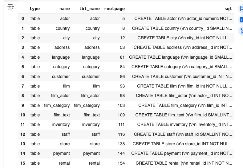
In this exercise, I imported sqlite and pandas and then used sakila database located within same folder:
import sqlite3
import pandas as pd

con = sqlite3.connect('sakila.db')

def sql_to_df(sql_query):
    df = pd.read_sql(sql_query, con)
    return df
and now a SQL query:
query = '''
    SELECT *
    FROM sqlite_master
    WHERE type = 'table';
'''

tables = sql_to_df(query)
tables
result:
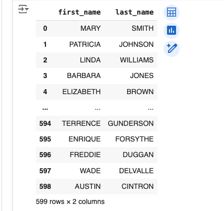
Let’s try another query:
query = '''
SELECT first_name, last_name
FROM customer
'''
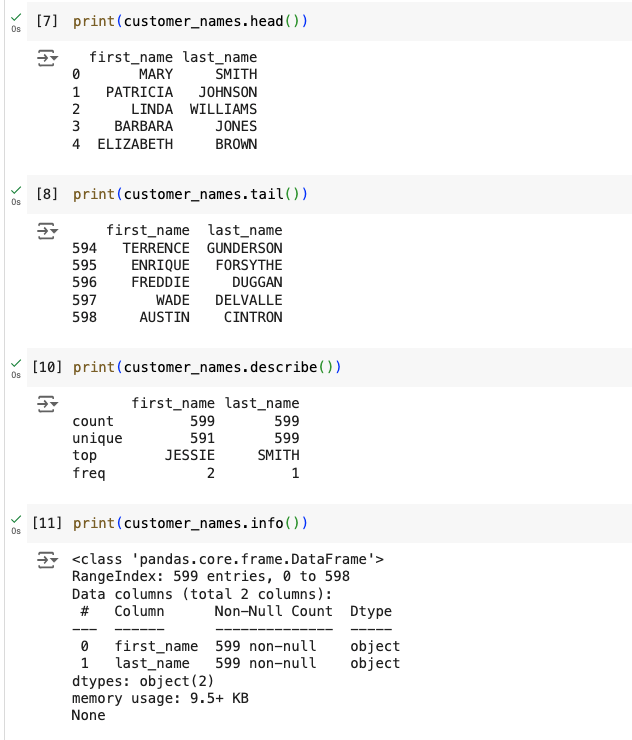
customer_names = sql_to_df(query)
customer_namesresult:
A little more complicated query:
 query = '''
    SELECT *
    FROM film
    WHERE description
    LIKE '%Pastry%'
'''

pastry_films = sql_to_df(query)
pastry_films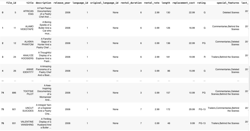
Let’s drill down:
query = '''
    SELECT
        COUNT(title) AS Count,
        rating
    FROM film
    WHERE description
    LIKE '%Pastry%'
    GROUP BY rating
    ORDER BY Count DESC;
'''
pastry_films_by_rating = sql_to_df(query)
pastry_films_by_rating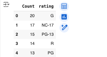
Additional Work
import sqlite3
import pandas as pd
import numpy as np
import matplotlib.pyplot as plt
con = sqlite3.connect('sakila.db')
def sql_to_df(sql_query):
df = pd.read_sql(sql_query, con)
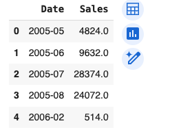
return dfquery = '''
SELECT
strftime('%Y-%m', payment_date) AS Date, ROUND(SUM(amount), 0) AS Sales
FROM payment
GROUP BY Date
ORDER BY Date ASC;
'''
Now let’s run that:
Let’s use matplotlib functionality to visualize the data:
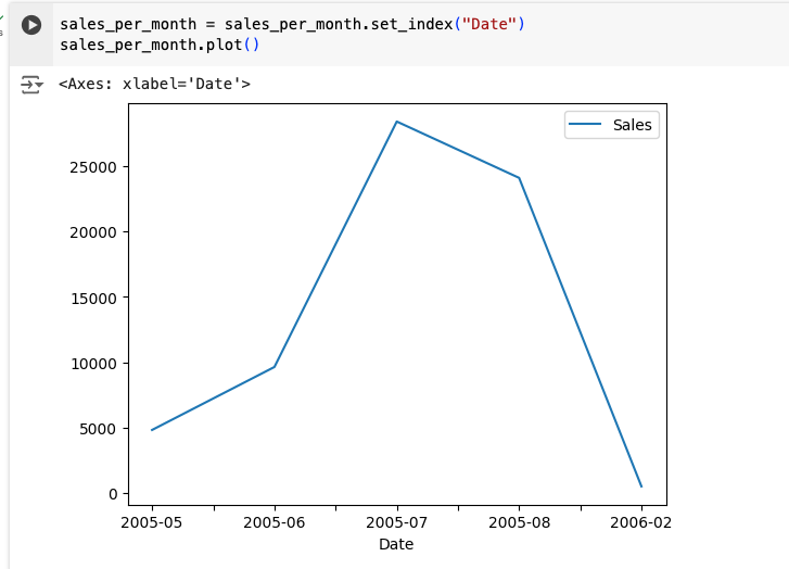
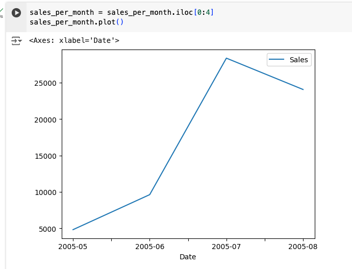
Let’s limit the data being provided to just four months:
Matplotlib and subplots
Time for some additional functionality! We’ll use this interesting library to better understand the data:
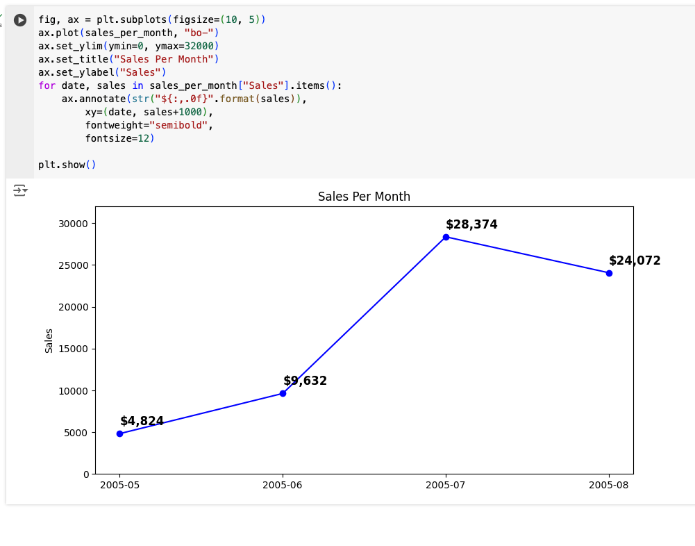
Here I used a 10×5 subplot. The for loop is doing something interesting. The for loop in our code loops over the sales_per_month DataFrame. For each item, it creates an annotation on the plot of the amount of sales per month, at the location specified by the data and the sales amount for that month.
I’m going to include the following code simply as a personal reference:
query = '''
SELECT
cat.name category_name,
sum( IFNULL(pay.amount, 0) ) revenue
FROM category cat
LEFT JOIN film_category flm_cat
ON cat.category_id = flm_cat.category_id
LEFT JOIN film fil
ON flm_cat.film_id = fil.film_id
LEFT JOIN inventory inv
ON fil.film_id = inv.film_id
LEFT JOIN rental ren
ON inv.inventory_id = ren.inventory_id
LEFT JOIN payment pay
ON ren.rental_id = pay.rental_id
GROUP BY cat.name
ORDER BY revenue DESC
limit 5;
'''
categories_by_gross = sql_to_df(query)
categories_by_gross
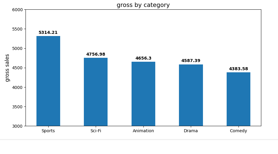
fig, ax = plt.subplots(figsize=(10, 5))
ypos = np.arange(len(categories_by_gross["revenue"]))
bars = ax.bar(ypos, categories_by_gross["revenue"].round(3), width=0.50)
ax.set_xticks(ypos)
ax.set_xticklabels(categories_by_gross["category_name"])
ax.set_ylim(ymin=3000, ymax=6000)
ax.set_title("gross by category", fontsize=14)
ax.set_ylabel("gross sales", fontsize=12)
for bar in bars: # add data labels
height = bar.get_height()
ax.annotate(f"{height}",
xy=(bar.get_x() + bar.get_width() / 2, height),
xytext=(0, 3), # 3 points vertical offset
textcoords="offset points",
ha="center", va="bottom",
fontweight="semibold")
plt.show()Here’s the result
And a pie chart:
explode = np.zeros(len(categories_by_gross["category_name"]))
explode[0] = 0.1
print(explode)

fig, ax = plt.subplots()
ax.pie(categories_by_gross["revenue"].round(3), explode=explode, labels=categories_by_gross["category_name"],
       autopct='%1.1f%%', shadow=True, startangle=90)
ax.axis('equal')  # Equal aspect ratio ensures that pie is drawn as a circle.

plt.show()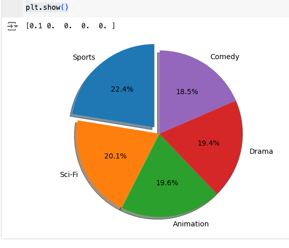
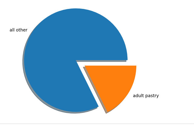
Another query:
query = '''
    SELECT
        COUNT(title) AS Count,
        rating AS Rating
    FROM film
    WHERE description
    LIKE '%Pastry%'
    GROUP BY rating
    ORDER BY Count DESC;
'''

df = sql_to_df(query)
df.set_index('Rating', inplace=True)

num_adult_pastry = df.loc['NC-17', 'Count']
total = df['Count'].sum()
labels = ['all other', 'adult pastry']
nums = np.array([total, num_adult_pastry])
nums

explode = [0, 0.2]

fig, ax = plt.subplots()
ax.pie(nums, labels=labels, explode=explode, shadow=True)
ax.axis('equal')

plt.show()
And the result: